Chitraan


Market Research
Understanding the Problem
The inspiration for a journaling app stemmed from the realization that many people struggle with overthinking and I am having a hard time too.
We all at some point have been an overthinker in our lives due to various factors. Let us call ‘em superhumans.
Superhumans often have a constant stream of thoughts, ideas, and emotions that can feel overwhelming and unmanageable.
I have been told on my face often that I am an overthinker(i might say superhuman).
Existing Apps
A thorough analysis of existing journaling and note-taking apps revealed several gaps(personally for me):
(e.g. Day One, Diarium, new iOS Journal)
-
Limited Tagging and Search Functions: Many apps lacked advanced tagging systems that allowed users to organize thoughts effectively. (advance search)
-
Inadequate Reflection Tools: Few apps provided features that encouraged users to revisit and reflect on their past entries. Just logging is not enough.
-
Lack of Cross Platform support: iOS Journaling app is so far great, but has no support for Android.
Through initial surveys and discussions, it became clear that while many existing journaling apps allowed users to document their thoughts, few provided tools to organize, reflect, and derive insights from them.
Identifying the Target Audience
The primary target audience for Chitraan includes:
- Overthinkers(also superhumans): Individuals who have a tendency to overanalyze situations and often feel mentally cluttered.
- Self-Improvement Enthusiasts: Users who are actively seeking tools to enhance their personal growth through better self-reflection and mindfulness.
- Creative Professionals: People like writers, designers, and artists who have frequent bursts of ideas and need a structured way to capture and organize them.
User Needs and Preferences
Interviews and surveys with potential users highlighted specific needs:
- Ease of Use: Users wanted a simple and intuitive interface that didn’t add to their mental load.
- Customization: Flexibility to tag and categorize thoughts in a way that made sense to them personally.
- Cross-Platform Availability: A significant portion of users expressed a desire for an app available on both iOS and Android, ensuring they could access their journal across devices.
So lets build one.
Feature Development
Understanding superhuman’s needs
Prioritizing Core Features
Given the wide array of possibilities in a journaling app, we prioritized features that would most effectively address our users’ pain points (also by copying features already available in other journaling apps, because why not???):
-
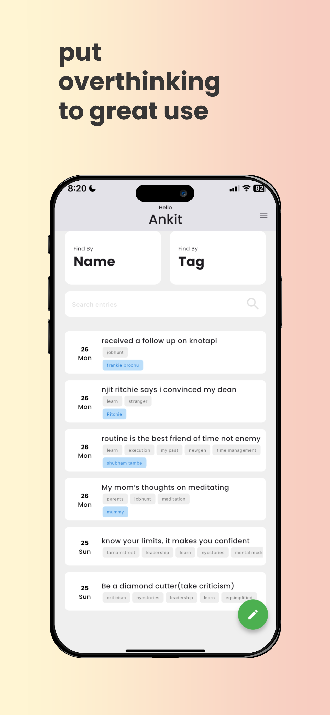
Tagging System: An intuitive tagging system that allows superhumans to categorize their entries in a way that makes future retrieval simple and effective. This was crucial for superhumans who wanted to search for specific moments, ideas, or feelings.
-
Advanced Search Capabilities: Knowing that superhumans often need to revisit specific thoughts, we built robust search functionality. Superhumans can search by title, content, or custom tags, making it easy to find entries quickly.
-
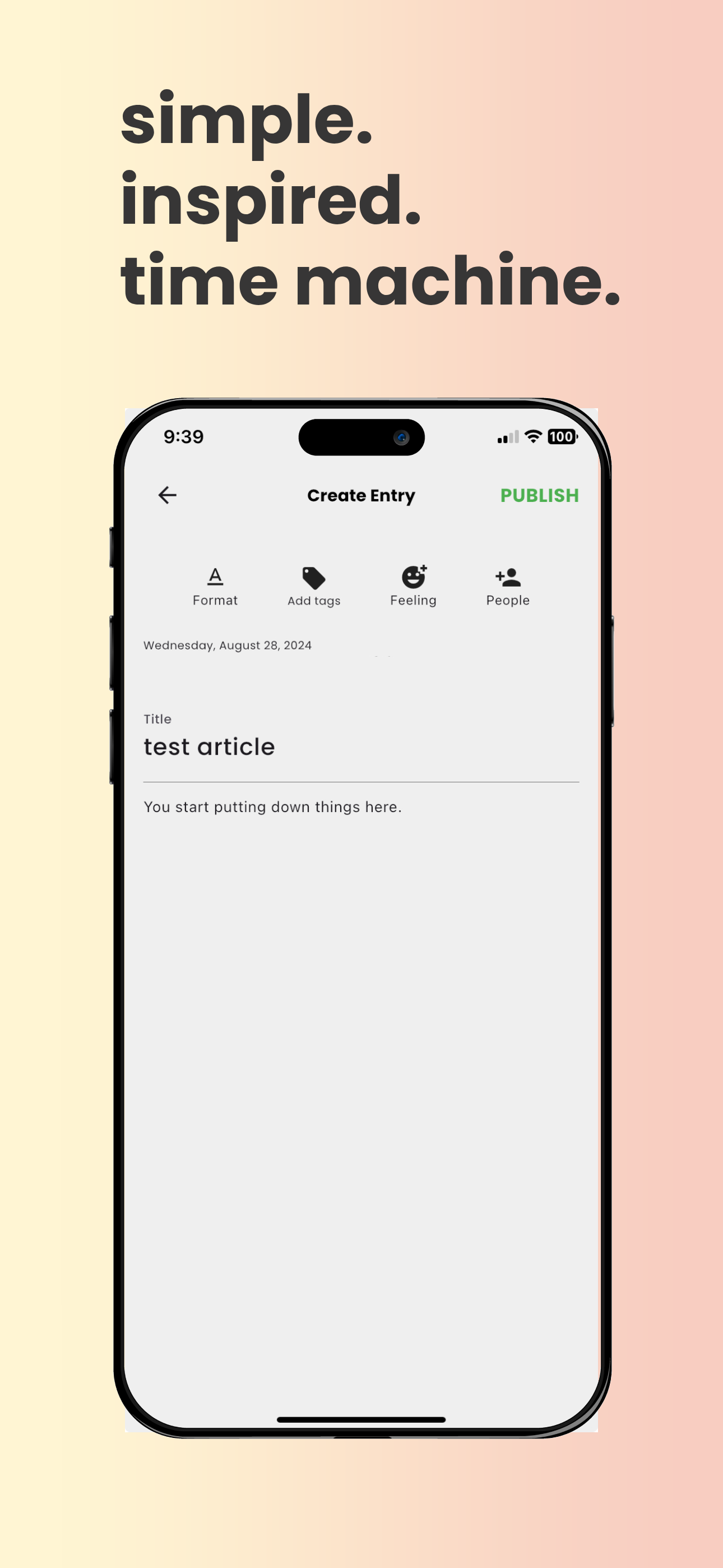
People and Emotion Tagging: The ability to tag people and emotions in entries, adding layers of context. This feature was designed to help users remember who was involved in particular moments and track their emotional journey over time.
-
Location Association: To add even more depth to the journaling experience, there is location tagging. This allows users to attach a place to their thoughts, providing context about where certain ideas or emotions occurred. Which we will come back to later for a feature.
-
Insights and Progress: As Peter Drucker said, You cannot improve something you don’t measure. It is important for our superhumans to be able to glance back at their notes, words, feelings, tags and review them. As of now v0.5.5 does not have that. But it will, that is the whole point.
User Experience (UX) Design
Loosely inspired by this
Design Philosophy
The focus was on minimizing friction, so our superhumans could concentrate on capturing their thoughts without being bogged down by complicated interfaces or unnecessary features.
Intuitive Interface
-
Clean and Minimalistic Design: The app’s interface is intentionally minimalistic, with a clean layout that guides the superhuman’s attention to the core functionalities: writing, tagging, and searching. This approach reduces cognitive load, making it easier for superhumans to navigate the app and perform tasks without distraction.
-
Easy Navigation: I ensured that every action a superhuman might take—whether it’s starting a new entry, tagging an existing one, or searching through past entries—is accessible within a few taps. Key functions are always within reach, enabling a superhuman to move swiftly between tasks.
Responsive Design
-
Cross-Platform Consistency: Since Chitraan is available on both iOS and Android, it was crucial to maintain a consistent experience across platforms. I adhered to each platform’s design guidelines while ensuring that the core experience remained uniform, providing familiarity to superhumans regardless of their device.
-
Adaptability: Chitraan was designed to be fully responsive, working seamlessly on devices of all sizes. Whether superhumans are accessing the app on a smartphone or tablet, the interface adjusts to provide an optimal viewing and interaction experience.
Feedback-Driven Iteration
-
User Testing: Throughout the design process, I conducted user testing sessions to gather feedback on the app’s usability. Insights from these sessions were invaluable in refining the app’s design, ensuring that it met the needs of its target audience.
-
Continuous Improvement: Post-launch, I actively sought user feedback to identify pain points and areas for improvement. Regular updates were rolled out to enhance the UX based on real-world usage, demonstrating a commitment to delivering a superhuman experience that evolves with the needs of its superhumans. We are still at 0.5.4, I am kidding in this above point, we still have to gather a lot of feedback. Don’t believe everything you read on the internet.
Engineering
MERN + Flutter + AWS EC2
Architecture and Technology Stack
Mobile application is built using Flutter, a framework that allows for consistent performance across both iOS and Android platforms. To provide a rich text editing experience, Chitraan integrates the Quill Editor, enabling superhumans to format their notes with a variety of styles.
Why flutter? - A. less hassle of two codebases and good surface rendering support
The backend - Amazon EC2 instances, where Node.js and Express serve as the foundation for the API hosted at api.chitraan.com. This setup allows for efficient handling of requests and smooth communication between the app and server. MongoDB, also hosted on EC2, is used as the primary database, offering flexibility and scalability for storing superhuman data.
Frontend, built with React.js, is hosted on Netlify, providing a fast and reliable interface for superhumans.
Security and Deployment
Security is a top priority as we hold a lot of personal data. The API (api.chitraan.com) is secured with SSL certificates managed by Certbot and Let’s Encrypt, ensuring encrypted communication between the server and superhuman’s devices. This helps protect superhuman’s data from potential interception.
For the app’s deployment, the mobile versions are signed using Apple provisioning profiles for iOS and Java Keystore for Android, ensuring that the app is securely distributed through the respective app stores.
I also placed a app version controller in place to render the old app versions obselete.
JWT tokens are issued with access and refresh token logic.
also I have containerized images using Docker compose for easier microservice management.
Continuous Integration and Performance Optimization
Chitraan utilizes continuous integration practices to streamline the development process. By automating testing and deployment through platforms like GitHub Actions, Netlify CI and Firebase app distribution the team ensures that new features and updates are released with minimal disruption.
Performance is optimized through the use of lazy loading for journal entries and media, reducing load times and memory usage on mobile devices. This ensures that Chitraan remains fast and responsive, even when handling large volumes of data. having said that, there is a ton of room for optimization.
Launch Strategy
1. Pre-Launch Preparation
Before launching, some market research to understand our target audience—individuals prone to overthinking who could benefit from structured journaling. We also identified key influencers and early adopters in the mental wellness and productivity space to help generate buzz.
2. Beta Testing
Initiated a closed beta testing phase, inviting a select group of superhumans to try out Chitraan before its official release. This allowed us to gather valuable feedback on usability, performance, and features. Used this feedback to make final adjustments, ensuring the app met the needs of our superhumans. Honestly I had only 4 testers xD.
3. Marketing and Branding
Crafted a clear and compelling brand message: “Put overthinking to great use.” This message was consistently communicated across all marketing materials.
4. Cross-Platform Launch
The app was launched on both iOS(27 August, 2024) and Android platforms(4 sept 2024), with Android lagging a bit behind. We worked closely with both the App Store and Google Play Store to ensure that our app met all guidelines and was featured prominently in relevant categories. This part out of everything, drained me mentally and I had to journal this scenario. I needed an app to Journal. Wait a minute!
5. App Store Optimization (ASO)
We implemented a comprehensive ASO strategy to increase visibility in app stores. This included optimizing the app’s title, description, keywords, and screenshots to ensure it appeared in search results for relevant queries. We also encouraged early users to leave positive reviews and ratings, which helped improve our app’s ranking.
6. Launch Day
Just launched it, because I need a job and cannot put so many hours into this. But it was impressive that I was able to take an app up in such less time. As what she said, Ankit be more aware of your strengths and weaknesses.
7. Post-Launch Follow-Up
After the launch, I grabbed a crate of bear for my room mate and me, Blue Moon, back to facing the reality of not having a job. As i write this, 3 hours ago I received a rejection email from an interview yesterday.
8. Continuous Improvement
The launch was just the beginning. I am committed to continuously improving Chitraan based on user feedback and market trends. Regular updates, new features, and enhancements have kept the app relevant and valuable to our users, driving sustained growth.